The Anatomy of a Great Landing Page
With a huge marketing budget comes huge traffic to your website. And huge traffic means your marketing plan is working, so you’re pretty much all set and done.
That was just a test because you’re only getting started.
Unfortunately, all the traffic in the world won’t mean a thing if it doesn’t convert into sales. Hence, your primary goal after scoring a significant number of visitors to your stores is to convert them into buyers and send your online business flying towards success. And for that to happen, you need good landing pages. No, you need great landing pages. And this is what you’re here to learn: How to build Product pages that convert.
Without a great landing page, your website is akin to a car without engine oil in a racing match. Hence, this article is an anatomy of an awesome landing page that helps you reach the finish line. What you learn here, you can apply it all to your online store, and it’ll work like a charm in converting your visitors.
Let’s get started.
Don’t Clutter Your Landing Page
Clutter is the first thing you should think about if you plan on creating great landing pages. Many merchants make the faux pas of overcrowding their landing pages with loads of information and cram as many products as possible in the hopes of selling more, but all they do is scare or disgust the customers away. Disgust may be a strong word here, but it’s true.
Here is a difference between selling and overwhelming your customers:
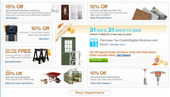
The picture above is a prime example of a cluttered landing page. What do I buy? Which product do I save my money on? Is 10% off on this a better deal than 15% on that? What is the quality of these products?
Questions, questions, and questions!
I’ll probably stay indecisive and eventually leave.
The following landing page, on the other hand, is an example of a great landing page:
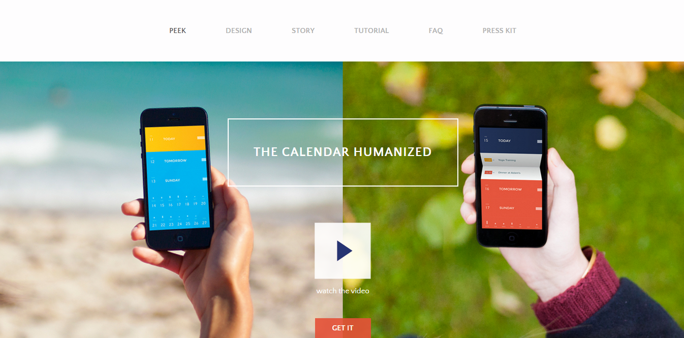
Just the right amount of information, visible navigation panels, and tells you exactly what you’re about to get: The Calendar Humanized.
Fast Load time
Imagine finding a good deal, you click on the link, and the page starts to load. You wait an eternity, and an image pops up. You’ve grown old, had 3 kids, and are now nearing retirement age; and the page finally loads up. By now, you’ve lost all interest in what you wanted to buy.
Now that was an exaggeration at its finest, but the feeling is somewhat along those lines. People don’t like to wait. And certainly not for a web page to load. So you have to ensure that your landing page loads in an instant and people can get what they want before they have a chance to look for other options. If your landing pages are well-optimized and deliver on the promise of a good experience, it’ll automatically bring those customers back for more purchases.
Better Visuals
Personally, I’m more inclined towards buying a product that is clearly displayed and has pictures that look real and not stock photos. That gives the customer more confidence in the products and builds trust.
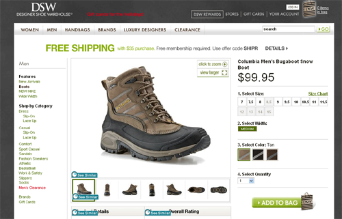
In the picture above, the shoe is clearly visible, gives you more angles to look at, and lets you enlarge so you can take a closer look.
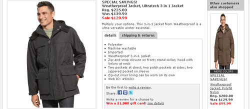
Ugh, what? $129 for what? The picture above does not give you enough confidence to click on the purchase button.
Give your customers different angles of the same product and incorporate features like zoom-in. Hire a photographer who can make photos look great with different lighting and (insert photography jargon). In short, make sure your product pictures are done professionally, whether you hire someone, or do it yourself!
Clear Calls-To-Action
There’s this CTA:
And then there’s this CTA:
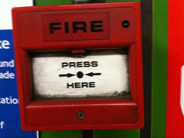
Unfair comparison, of course. But it will give you a clear idea about a good CTA, and a really, really bad CTA. While you’re not going to emulate the picture above, it’s still a piece of cake to fall into the trap of a bad CTA if you don’t know your way around it.
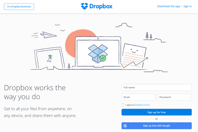
You want it to be clear what you want your customer to do at any step. Confusion can kill the experience. So if you want them to proceed to checkout, make it stand out. Make it clear and make it obvious. Design a button with colors that pop out. Zappos, for example, uses a bright orange button for ‘Add to shopping cart.’ Have a look:
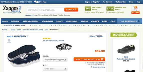
The customer knows exactly what to do.
Keep it Minimal
No, this point does not conflict with the first point. It does, however, complement it rather nicely.
When it asks you to keep it minimal, it does not mean that you should exclude important information and adopt a minimal design. It means that you should convey the right message in as few words as possible and keep the page clean. Try to convey the description of the products as concisely as possible. Say more in fewer words. You do this, and you’ll see people buying more often from you because no one wants to read an entire essay crammed in a small space when they want to make a quick decision.
Here’s Prezi’s landing page:
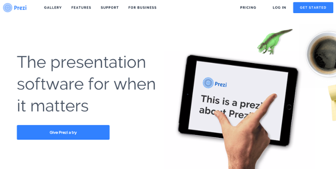
Seven words face you, but they hit where it matters, and it compels you to give it a try.
If they want more details, they can go to your blog (you do have a blog, don’t you?).
Pull All the Strings Together
You’re pretty much all set to start converting your visitors like crazy. Once you have spiced up all the formula above, you’ll have created a high converting landing page. Everything you read above (and are now applying to your landing pages) is the basics to start converting. And best of all, there’s no rocket science to any of it!
So what are you waiting for? Start converting. And don’t forget to share this article with your friends who have had difficulty in converting till now!