Your checkout page is like a double-edged sword. It can either enhance your conversions or scare away the customers to your competitors. For every ecommerce business, the design of the checkout page is of paramount importance as it influences the business growth.
Besides having genuine products and services, you ought to have a website that ensures a smooth user experience with easy navigation. It is interesting to know that 70% customers abandon the shopping cart on the checkout page. This implies that they are interested in shopping from you but there was an issue with the checkout process owing to which they did not complete the transaction. In order to make sure that these interested shoppers purchase from you, it is imperative to buy Rapid SSL Certificate for secure transactions.
The certificates protect confidential information and encrypt the data transfer over the Internet. Besides, you should optimize your checkout page design at regular intervals to amp up your conversions and bring greater ROI.
Here are some ideas that you should consider while designing the checkout page.
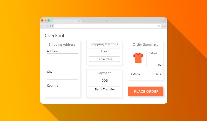
Minimize the Clutter
Your checkout page should be neat and simple without any unnecessary elements or distractions. 21% ecommerce shoppers do not complete the purchase due to the long checkout process. This reflects the importance of a short and fast checkout process. The following tips will help you achieve this idea:
- Highlight the compulsory fields using asterisks.
- Product categories, latest offers, and latest deals can distract the customers, thereby leading to incomplete purchase.
- Your form should be short.
- Highlight features like free shipping or easy returns policy.
- Your customers should be able to modify the products in their cart or change the quantity.
- Use breadcrumbs that display the entire checkout process and show their journey to the store. For example Login – Delivery information – Billing details – Review the order – Payment – Confirmation
Allow Guest Checkout
Studies have concluded that 23% online shoppers abandon their carts if it forces them to create an account during checkout. A workaround for this problem is a guest checkout option that simplifies the checkout process.
Setup Live Chat
According to a survey by Forrester, 44% people find a live customer service representative as one of the top features of an online store. Moreover, 91% users found live chat feature effective in solving their queries. If you are dealing with products that require technical help, live chat proves to be of great help in encouraging the customers to complete the purchase.
Easy to Fill Forms
Long forms with too many fields are a major turn off for shoppers and often leads to higher cart abandonment rate. Make sure you ask only the required information and offer a quick checkout. For returning customers, you can pre-populate the fields with the already available information like address and zip code. If your form includes optional fields like address landmark and alternative contact information, you should highlight it. Display a validation error by bringing attention to the field that requires to be filled.
Mobile Friendly Checkout
50.3% ecommerce customers are mobile users and your checkout process should reflect this change. Use color contrast for different call-to-action buttons for mobile-friendly navigation. You can automatically set number keyboard for fields like phone number and alphabet keyboard for other text-based fields. As mentioned earlier, pre-populate the fields with information already provided.
Build the Trust
An effective idea for conversion rate optimization for ecommerce sector is assuring the customers that they are at zero risks of security breach and that their information is safe. You should convey to your customers that in case the product does not meet their requirements and they are not happy with it, they can return it. You can have a full refund policy to drive higher purchases. Build a strong online presence on social media platforms and interact with customers It is a good idea to display customer reviews, third-party trust badges, and SSL certificates
One-Page Checkout
Single page checkout works better psychologically as all the fields appear on one page, whereas multiple page checkout reflects longer checkout process. Although there are certain advantages of using multiple pages, most of the studies are in the favor of single-page checkout.
Wrap Up
While designing a profitable checkout page, your first priority should be to make it as convenient as possible. It should drive quick decision making for the customers by eliminating all the possible doubts that may arise in their minds while shopping online. The fewer the steps involved in the checkout, the higher is the conversion rate. To sum it all up, have a lightweight checkout page built with Accelerated Mobile Pages that makes the checkout a breeze.